CSS3 has come a long way since its inception in 1996. Back then, it was used to style the document headings, which were basically just large pieces of text. CSS3, however, allows us to style all sorts of elements, including text. In this article, we will learn how to create some simple CSS3 text hover effects.
The first effect we will create is a glowing effect. To do this, we will use the CSS text-shadow property. The text-shadow property allows us to add a shadow to an element’s text. We can also use it to create a glow effect by giving the shadow a large blur radius and making it white.
Here is the CSS code for our glowing effect:
span {
color: #fff; /* Make the text white */
text-shadow: 0 0 5px #fff; /* Add a 5px white shadow */
}
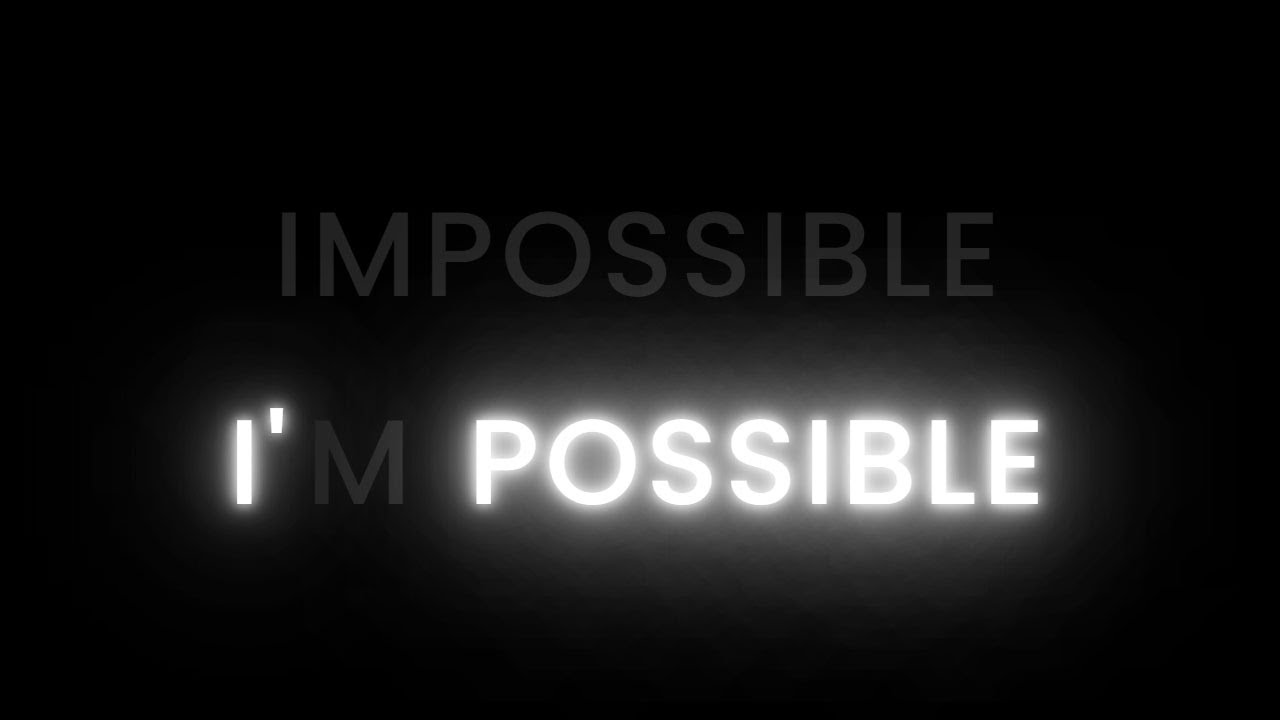
And here is how it looks in action:
As you can see, the text appears to be glowing. This is because the shadow is so large and blurred that it creates an illusion of a glow.
Next, we will create an effect that makes the text appear to be embossed. To do this, we will give the text-shadow property two values. The first value will be for the horizontal offset and the second value will be for the vertical offset. A positive value for the horizontal offset will make the shadow appear to be on the right side of the element and a negative value will make it appear on the left side. A positive value for the vertical offset will make the shadow appear to be below the element and a negative value will make it appear above the element. By giving our shadows different offsets, we can create an embossed effect.
Here is the CSS code for our embossed effect:
span {
color: #fff; /* Make the text white */
text-shadow: 2px 2px #666; /* Add a 2px right and down shadow */
}