Before you start designing your vinyl signs, be sure to survey the intended display area for design unity and even inspiration. Many graphic artists make the mistake of creating designs in a vacuum because they think that what looks good on their screen will necessarily look good in display. Although this is likely true, it misses out so many possibilities to incorporate existing elements into the design.
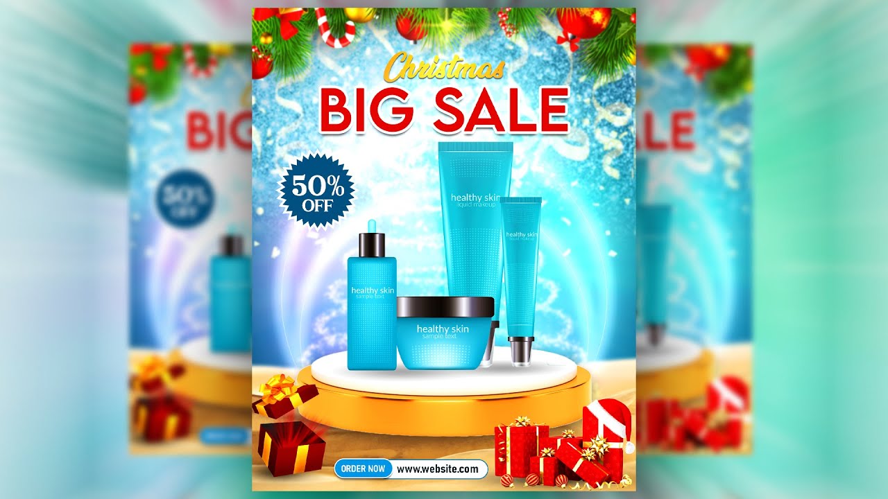
Your banners are primarily visual in nature with very minimal written content. It relies on its image to tell its story, and the colors and design to draw the customers’ eyes. With all the surrounding competition, it’s important to use every possible advantage your design can use.
When you want to maximize impact of your vinyl banners, be sure to take into consideration the context in which these will be displayed. Often this plays a big role in making your signs stand out or look be forgotten.
1. Maximize your design space.
A simple guess work allows you to approximate the size of your banner design, but it can create a lot of wasted space. Outdoor advertisements have more flexibility than most indoor advertisements when it comes to space. Designed for pedestrians and motorists, the signs are expected to be visible and farther distances than outdoor posters.
From how far away should your banners be seen and read? Measure the allowable space for your vinyl banners and use it to work with your design. Also consider the distance you want your signs to be visible when putting together your design elements. You may want to enlarge the text for instance if you want to be seen from a hundred meters away.
Vinyl banners are primarily used for its visual impact more than its textual content. The large visual display should be able to its message in seconds with pictures and minimal text. Additional information can be searched on your website or followed up with brochures or flyers.
2. Use contrasting colors.
When you want your banners to stand out, use the simple principle of contrasting colors and patterns.
For instance, when the banner is intended to be wrapped around a particularly drab building solid grey, you can highlight your ad and liven up the whole building with your extra bright and cheerful banner. You can also use photographs or complicated graphics to contrast against the solid background. This also works for banners that are hung like streamers as it contrasts against the monotony of the sky.
If the area on the other hand is already surrounded with plenty of bright colors and prints, like a busy city for instance, create plenty of white space and very simple graphics. The emptiness of the banner is a refreshing reprieve for the viewers’ tired eyes.
3. Use complimentary design concept.
The context should give you an indication of the demographic demarcations or the interests of the people who visit the area. If you are a coffee shop and the shop beside you is a pet shop, your banner can show a dog sitting at a table while its owner drinks coffee.
Give a happy picture of the environment to come up with design ideas for your vinyl signs. You can use this to suggest an association between the environment and your product.